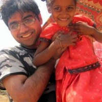
Niladri Mitra
from Kolkata |
Deals with some humor... usually sarcastic, and lots of gloomy and depressing (call it depressed) short pieces that I prefer to classify as 'thought provoking' . The remaining posts (results of not being moody or jovial enough... stuck somewhere in between) are attempted aticles. Poetry as well prose... depending on how much time I had in hand while composing.
Edited
Reason: Typo error(s)... :/
Reason: Typo error(s)... :/