
Looking for suggestions to increase my ability!
My blog is all about how I steal the Lively side of My life, through My Colorful Eyes...
I believe that One should be capable of analysing the things to how far it could be on our positive side, to LIVE Our Life!!
I welcome your every suggestion to improve my capabilitites.
Thanks & Regards,
Vysh

I felt you didnt need any suggestions, cool blog you got.  The only issue with the blog i saw was the Back ground and letter colour where both brown. try to change the word colour to make it look more visible. Eventhough i tried hard write some problem, i failed
 . Keep blogging
If possible review my blog too. http://www.indiblogger.in/forum/review.php?id=9026

Dear Vyshnavi,
It's a beautiful site.
i liked the pictures. You have put lot of effort in your site.
couple of suggestions-
Reduce the picture size, so that the content will be visible better.
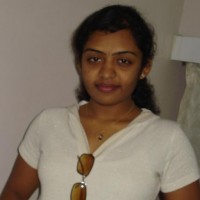
Change the Sindu Mohan picture, its blurred.
Best Regards,
Ishita Sharma
www.investmentbazar.com - Visit my site and provide comments/feedback
Just a Word... It's Sindu Vinod..  Actualy it's the pic taken in a hurry..
Thank you Ishita!! 
I've visited Ur site.. Seriously I understood nothing! Actually no idea.. Oops! Sorry..