
hello. help make my blog better .
hi,
i just started a blog.i write about anything and evertything.
anywhere i can improve ?
help would me much appreciated.

gave a peep to your space... will try to help you out tomorrow... cheers 

Hello Nilanjana!
My observations are:
1. Have more posts on the front page. You've enabled only two posts to be displayed on the front page which makes the user click 'older posts' link, which is at times annoying. I would advise you to keep atleast four posts on the front page.
2. Align images uniformely: In your recent post, the images are aligned alternately to the left and right, which makes the eyes of the reader wonder here and there. So better align all the images on one side and keep the text on other side. So that the text becomes easy to read.
Rest your blog is rocking. The content is very interesting. Happy blogging!
Do check out my blog. Looking for your valuable feedback.
hi,thanks for your feedback.helped a lot.
i saw your blog.in one word - classy.
i personally love black and white combo though some people may find it dull.
i honestly cant find anything to improve.maybe you could highlight "popular posts" and "categories" so that people will be interested to navigate around your blog more.
cheers !
First Impression: - Colourful but not glary. No Wow factor though… Let me read the post… after all it’s not so lengthy and got Capt Planet in it!
Design: - Simple, spacious, neat & clean suits the place better… Colour combination is soothing to our eyes… the Title of the header could be made one font or two larger to fill up slightly more than half of the horizontal space to eliminate the blank look at the other side.
Navigation / User friendliness: - Navigation is easy coz the page hardly has any complex element to make it hard. Anyone can browse the blog but a novice surfer won’t get a clue how to read or whether any other posts than which are being displayed on the homepage even exist! Look, there’s a list of labels/tags and another list is for archives… so it’ll be great to make another list where the visitor can read the post titles directly and click to open them and place it just below ‘About Me’
Contents: - From latest two posts as visible on the homepage, I found your writings ‘easy to read’ and well articulated. Font is OK but formatting has to be taken care of. And never forget to give owner credit to the Pictures you borrow from google (give the original source link or Photographer’s name along with his link if he has got one). Same goes for text if borrowed from somewhere.
Frequency: - Looks fair in recent time. I feel it’s better to avoid posting multiple posts in a single day and keeping a long post-free period ahead. May be readers will be more interested to read one post from your blog at a time and thus the post which is down the page is unlucky to get even a single stare. So make the distribution of post/day/week/month even.
Strength: - Simplicity of design, writing and the ample room which acts as the conditioner for our eyes and mind.
Improvement corners: - A readymade Post list, crediting the picture source, frequency of post etc have been discussed earlier. I didn’t find much/any comment in your posts… well… to expect some motivation from fellow bloggers you need to motivate them as well… getting me right?... moreover as you read others’ blogs you’ll diversify your thought process and improve your vocabulary… so good in both ways!
Any other comment/suggestion: - Keep writing and reading… they’re badly and madly complementary…. And also interact with your blogger friends to keep your blog jolly.
(PS: - I'm neither a 'Reviewer' nor a blog analyst, so these are simply my thoughts on your blog from a fellow-forum-member's/visitor's neutral perspective. As you had asked for a review in public I did all these bLa bLa and therefore I won't be in any position to take the accountability for any negative thing that may arise due to this noise pollution. Cheers and good luck Nilanjana!)
ooo.thanks a lot.you boosted my confidence a lot.
and thanks a lot for the point about giving credit to the pictures i borrow.it totally slipped my mind.most of the pictures have been clicked by me though,some of course i googled :D

Hi,
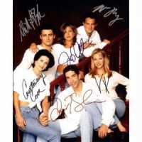
Your blog has a very nice design and goes easy on the eyes. Thank you for keeping it that way. Thanks for the post about the 90's. So many memories brought back.
I would like it if you adjust your body width such that it the content is centered rather than on the side. Personally, I feel that the gadgets need not have so much wide space. But, this is just my personal opinion. Other than that, your blog looks great. Happy blogging.
thanks.i did decrease the width of the gadget space so the blog could have more space ! :)